Dimensions is a free website dimensions extensions for Google Chrome which let’s you check how website design that you’re creating will look like on displays of various different portable devices, mostly tablets and smartphones. Tablet website dimensions shouldn’t be a problem on larger displays, but for smaller ones, if you’re not careful, everything might end up looking skewed and/or broken. With Dimensions you can check and see how your design will act on practically every display size.
Screenshot down below shows this free website dimensions extension in action. We have our site open using the address bar at the top, and adjusted the ruler so that the display down below fits that of a wide phone.
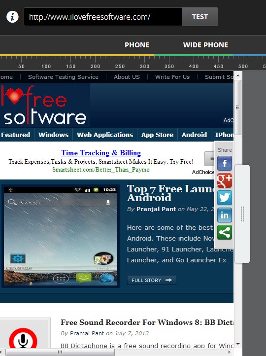
Other dimensions are available as you move the slider which can be seen on the right sidebar of the website preview box down below. You can set size of the display to a pixel if you want. For the entire time that you’re moving the slider, you’ll be able to keep track of the website design changes in the preview box down below.
Key features of Dimensions are:
- Free and simple to use: easily change settings and configure everything
- Allows you to check how your website looks like in different dimensions
- Can be used to preview website dimensions on tablets, smartphones, etc.
- Preview mode: emulates the interface of an actual device
- Comes with device display presets: iPhone, Android, iPad, etc.
- Works with Google Chrome: opens up in a separate tab
Similar software: MeasureIt.
Next to the main website dimensions tester which can be seen on the first image above, this free extension also has an additional Preview mode where the entire interface of the device is shown with the website inside it so you can see how the website will look like when accessed on an actual device.
How to preview website dimensions tablets, smartphones using Dimensions: free Google Chrome extension
Install the extension from the links down below and when it installs, run it. It will open in a separate tab. Type in the address of the website design that you’d like to preview in the top left corner address bar. This can be local URL to a file, localhost URL (if you have a web server setup) or an actual live website.
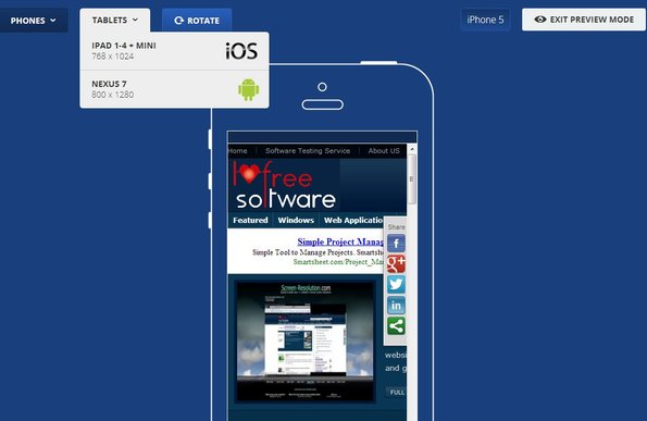
First the main tester allows you to set manually the dimensions of the display that you’re interested in checking (see the first image from the top). By clicking on the Preview Mode button from inside the main tester you can open up device display emulation. This allows you actual preview how your website dimensions will handle small displays of tablets, phones, etc. You can even rotate the screen using the Rotate button at the top.
Conclusion
Dimensions is a very handy extension that should be in the arsenal of every web developer. When creating websites, it’s important to see how their layout will behave when showed on small displays and that’s exactly what you can do with this free website dimensions extensions addon for Chrome. Give it a try and easily preview your work on smaller displays of tablets and smartphones.