Here’s a list of 5 responsive design testing extensions for Chrome which can used by web developers or just website owners to test how responsive their website design is. Responsive design takes into account modern devices with smaller screen sizes that exist out there and makes sure that websites are easily readable there as well. These extensions can help you test just how responsive you web site is.
Let’s have a look at these extensions below.
Responsive Web Design Tester
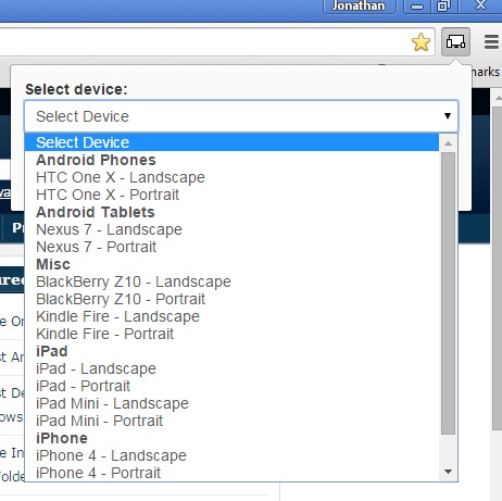
Responsive Web Design Tester will give you presets that can help you test website responsiveness for popular Android phones (HTC), tablets (Nexus), Blackberry, Kindle Fire, iPad and iPhone.
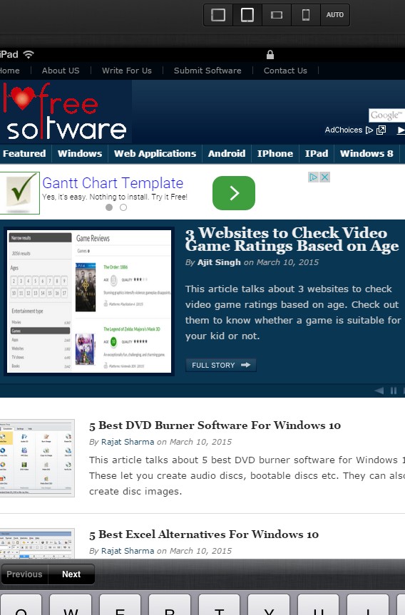
It opens up the entire website in a new window that has a smaller size. That way the extension is simulating smaller screen sizes of the aforementioned devices. Smaller window size will force your website elements to adjust to the new resolution that the window has, making the website easier to read if your website is responsive. If it’s not, you’ll just see scrollbars on the edges of the window.
Get Responsive Web Design Tester.
responsive-web-design
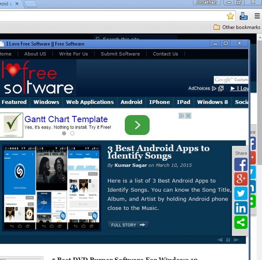
responsive-web-design has more broad presets, meaning they’re not brand specific, but more device specific. What this means is that there’s only a couple of resolutions and screen sizes to test. Only tablets, smartphones, both horizontal and vertical.
It’s possible to make the simulation even more realistic by turning on an on-screen keyboard and a top status bar in style of iPad and iPhone, see image above.
Also, have a look at 4 Similar Website Finder Extensions For Chrome.
Responsive Inspector
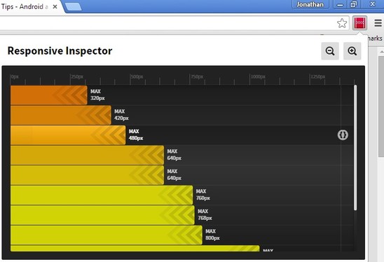
Responsive Inspector is a different type of a responsive design testing extension for Chrome. It will scan the website style rules and check what kind of resolutions are supported.
It will then give you a report so that you can see at which resolutions will responsive design kick in and change the website layout to something more suitable for the new screen/resolution.
Get Responsive Inspector.
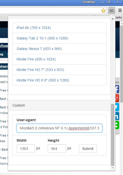
Mobile/Responsive Web Design Tester
Mobile/Responsive Web Design Tester works just like the first responsive design testing extension from the list above.
It comes with a list of popular smartphone and tablet brands (iPhone, Galaxy, Kindle, etc). Upon selecting a device type by left clicking on the top right corner icon, website in the currently active tab is going to be opened in a new window that simulates the screen size of the selected device. What’s different is that here it’s also possible to manually type in the resolution that you’d need to test.
Get Mobile/Responsive Web Design Tester.
Also, have a look at 5 Alexa Rank Checker Extensions For Chrome.
Responsive Design Tester
Responsive Design Tester has a bit improved selection of device presets, but it basically works just like Mobile/Responsive Web Design Tester.
Pick a device preset or type in the resolution manually and the website in the currently open tab will open up in a window that simulates different resolutions and screen sizes that were selected.
Conclusion
All five responsive design testing extensions for Chrome covered above are great and useful. I would have to say that my favorites are responsive-web-design and Responsive Inspector. Let me know what you think in comments down below.