Emmet Re:view is a free Chrome extension to see how responsive websites looks on different devices and resolutions. Checking your responsive website’s adaptability on different devices or resolutions can be a very hectic and time-consuming task. In such cases, this Chrome extension can come handy as you can do the same with ease and in no time. Using this extension, you’ll be able to see your website in different-sized views and also side by side such that you can compare the adaptability and responsiveness between devices or resolutions. The side by side screens will be synced together, which means you can scroll pages, click on links, fill up forms, etc. in one screen and see the reflection on other screens as well.
It comes with two different-sized views named, Breakpoints View and Device Wall. In the Breakpoints View, you will be able to see your website in different resolutions based on the CSS media queries. In the Device Wall View, it shows how your website appears on different devices like Apple phones, Android phones, Apple tablets, etc.
You may also like to read these interesting posts:
- Check How Websites Look In Multiple Versions Of Firefox
- See How Your Website Will Look in Different Fonts
See How Responsive Websites Looks on Different Devices and Resolutions:
Basically, there are two different views in which this extension helps you check out your responsive website’s looks. The first one is Breakpoints View and the other one is Device Wall. So, let’s get started with the views and see how a website looks on different devices and resolutions.
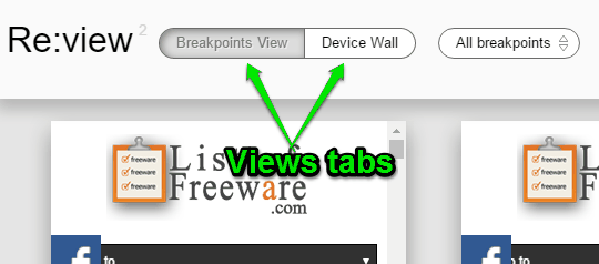
The first thing you need to do is install the Chrome extension “Emmet Re:view” in your browser. After that, open up your website in the browser and click the extension icon on the browser toolbar. As soon as you do that, the preview screen will appear with the views (Breakpoints View and Device Wall) tabs at the top of the screen. You can simply click on any tab to toggle the views.
Breakpoints View:
The Breakpoints View fetches CSS media queries from the currently opened page and then shows view for all the breakpoints. The breakpoints will be shown on multiple screens (if multiple CSS queries available) with different resolutions, as shown below.
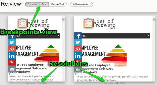
In the Breakpoints View, the extension lets you resize the screens horizontally by dragging the border of the right edge of each screen. Doing so, you’ll be able to adjust the predefined resolutions and see your responsive website in any custom resolutions.
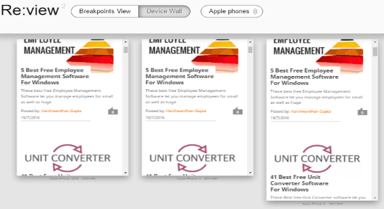
Device Wall:
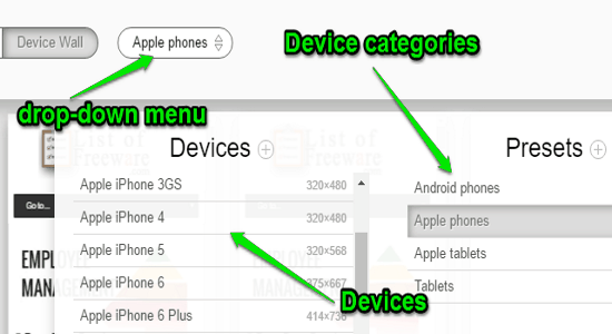
In the Device Wall view, you’ll be able to see how your website looks on different devices. When you select the “Device Wall” tab, a drop-down menu will appear adjacent to the tabs. You can click on the menu and select the device categories either as Apple Phones, Android Phones, Apple Tablets, and Tablets. For each category, it will show all the associated devices on the left.
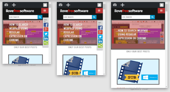
After selecting a device category, multiple screens (including all the device resolutions from the selected category) will appear on the main preview screen with your website’s currently opened page. For example, let’s say you’ve selected “Apple phones”, then you’ll be able to see how your website might look on iPhone 3, iPhone 4, iPhone 5, iPhone 6, and iPhone 6 Plus.
While in the “Device Wall” view, you can simply hold the “Shift” key to control the device screen for zoom in & out using the mouse wheel and drag view in order to pan around. Remember, the pre-defined list of devices from all the categories includes various devices from Samsung, Blackberry, Motorola, Apple, Sony, LG, and HTC. However, if you want, you can also add your own custom devices resolution by clicking the small “+” icon in the drop-down menu.
My Final Verdict:
Emmet Re:view is a simple extension with the main objective of assisting you in testing responsive website designs and how they appear on different devices and resolutions. If you ever wanted to know how your website might look on different devices or resolutions, then you got to try this free extension in order to do the same with ease.