This is a quick tutorial to explain how to visualize Apple Music statistics with a graph. To do this, here I am going to talk about a free and open-source tool called Apple Music Stats. It basically takes the iTunes library data from you and then creates a beautiful graph from it. With this, you will be able to see your top artists, top albums, and total number of hours you have consumed listening to them.
Although iTunes keeps track of the play count of the songs for you but there is no visual graph for you to analyze. And if you really want to see your library in a graphical view then you can use the simple tool I am mentioning here. The developer of this tool hosted it on Vercel and you can use it directly. Or, you can run it locally by grabbing its source code from GitHub.
How to Visualize Apple Music Statistics Graphically to See to Songs?
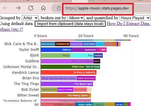
You can access this web app from here. It has a very simple interface. And it looks like this. Or, you can always host it on your server if you want to.
But before using it fully, you need to do something in Apple Music player first.
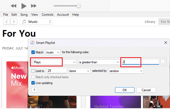
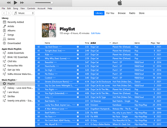
So, open Apple Music via iTunes on PC or Macbook. From the File menu, you need to create a smart playlist. Use File > New Smart Playlists option.
In the dialog that appears, select Plays in the first field and set the field next to it to “is greater than”, and set the value in the last textbox to 2.
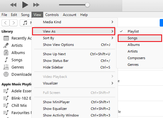
Proceed further and then use View As > Songs option.
Now, you need to remove the love and iCloud columns. Right click in the interface to hide these columns. And add a new column Year to this new smart playlist view.
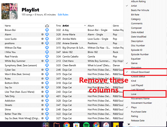
Make sure that only these columns are visible in the view: Title, Time, Artist, Album, Genre, Plays, Year
If you have only these columns then you are good to go. Just use Ctrl+A and then select all the songs with all data and then press Ctrl+C to copy the data to the clipboard.
Come back to the Apple Music Stats website and then paste the data that you copied already. There is a button on the website, Import from clipboard (data stays local). Click it and then data will be plotted and a graph will be generated.
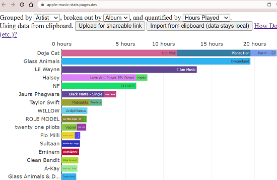
Once the graph has been generated, you can analyze it. You can see the top artists, albums, and number of hours you listened to a particular song. You can try this on some other Apple Music account or you can share this method with others to let them visualize their Apple Music library.
Closing thoughts:
If you are looking for a simple way to visualize your Apple Music library with graphs then you are at the right place. Just use the tool I have mentioned here and see detailed insights into your music listening habits. It will definitely help you uncover some hidden details about your songs that you were not aware of before.