Here is a list of 13 tools to test your website on different screen resolutions. These tools include PC, tablets, and smartphones of various resolutions and screen sizes. You can check how your website looks and works on a specific device and a specific screen resolution and screen size. You don’t have to install anything and you only have to paste the URL of the website.
These tools can prove to be really helpful for you to see how does your website look on a particular device and that too without even buying various devices. So let’s get started.
1. MobileTest.me:
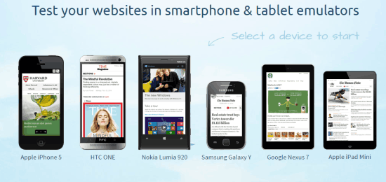
The first website in the list is MobileTest.me. This website lets you check your website on following devices: Apple iPhone 5, HTC One, Nokia Lumia 920, Samsung Galaxy Y, Google Nexus 7, and Apple iPad Mini. Each of these devices represents a specific screen resolution. Click on the device for which you want to check your website. After this, you have to enter the URL of the website you want to check.
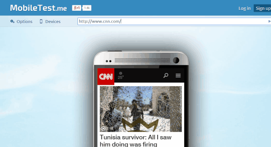
The tool will instantly show you how your website looks in the selected device. You can also interact with the website smoothly like you are using the phone in reality. There are also options to choose Landscape/Portrait mode and emulator as Responsive/Mobile.
2. mobiReady:
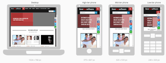
mobiReady is the website which doesn’t provide the option to choose the device, but it shows the website in all of its supported devices simultaneously. The website supports following devices: Desktop (1024*768 px), High-tier phone (375*667 px), Mid-tier phone (320*533 px), and Low-tier phone (240*320 px). You can interact with the website in any of the available devices. The tool also shows the page composition on the basis of HTML, CSS, JavaScript, and Images.
Other than this, the website also shows test scores which include mobiReady score, comparison of your rank with others, page weight, and website test results. The test results are shown to you on the basis of 38 parameters divided as: Minor fails, Major fails, and number of passes.
3. Screenfly:
The next tool in the list to check the website on different resolutions is Screenfly by Quirk Tools. The tool has 4 preset resolutions: Desktop, Mobile, Tablet, and TV. There is also an option to add custom screen resolution. You can interact with the website like reality and choose from following options: Refresh, Rotate, Enable/Disable Scrolling, Use Proxy Server, and even share the link with others.
4. Am I Responsive?:
Am I Responsive? is a very minimalist website with only a text box to enter the website URL and four devices to show how will the website look on each of them. The 4 devices are: Desktop, Laptop, Tablet, and Mobile. Just when you will enter the website URL and hit enter key, the tool will show you how your website looks on a particular device. You can also interact with the website preview.
5. MobilePhoneEmulator.com:
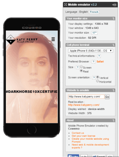
The website MobilePhoneEmulator.com has three sections: Your monitor size, Cell phone terminal, and Website to emulate. The first section shows you details related to your PC like display settings, window, monitor size, and resolution. The second section is for choosing the device on which you want to test the website. You can choose from the list of 13 devices along with the option of choosing screen orientation. The final section is the one where you have to enter the URL of the website which you want to test out.
6. Browser Stack:
Browser Stack is the website which has the list of 13 devices ranging from smartphones, tablets to PC and Mac. For each device, it shows the screen resolution, device model number, and running OS. For the selected device, you can further choose from landscape and portrait orientation. When you have selected the device and entered the URL, you can interact with them like you are using a real device.
7. StudioPress:
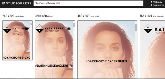
The next tool to check your website on different resolutions is provided by StudioPress. There are no options for you to customize the settings. There is a text field to enter the URL and then the list of 5 resolutions: 240*320, 320*480, 480*640, 768*1024, and 1024*768. You can browse through all the resolutions via a slider.
8. ResponsiveDesignChecker.com:
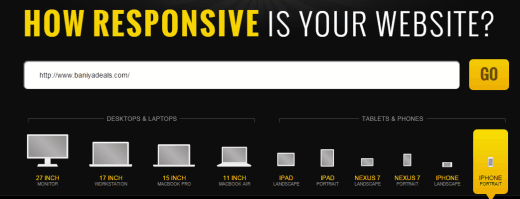
ResponsiveDesignChecker.com is the website which has divided all the supported resolutions into two categories: Desktops & Laptops and Tablets & Phones. You have to enter the website URL and choose the device on which you want to test it. The complete range of devices include 27″ monitor, 17″ workstation, 15″ Macbook Pro, 11″ Macbook Air, iPad (Landscape/Portrait), Nexus 7 (Landscape/Portrait), and iPhone (Landscape/Portrait).
9. Viewlike:
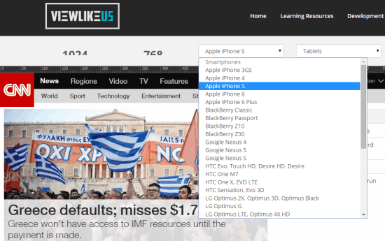
ViewLike is the website which lets you check your website on a variety of devices but also shows the responsiveness test results. First let’s talk about checking the website on different devices. You can choose from a variety of devices available under Smartphones and Tablets. There are devices from all sort of manufactures and with different resolution. You simply have to click on the name of the device to see your website on it.
Now talking about the test results, ViewLike shows you the response code, speed score, and usability score. There are also test details which mentions stats like loaded resources, number of hosts, HTML/CSS/Image response time, etc..
10. Infobyip:
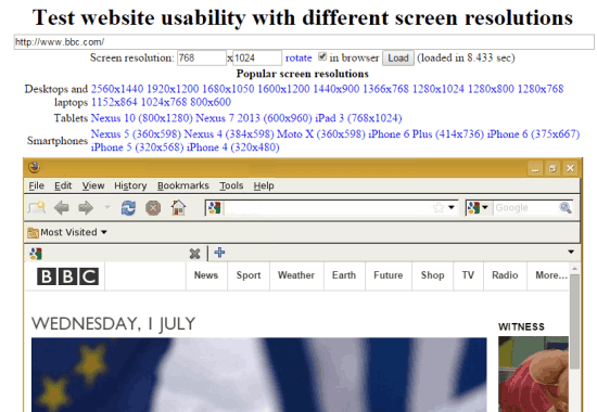
Infobyip is the website which has an old-school user interface which takes you to the lanes of 90s when websites used to be made up of plain HTML with no visual coating to make them look better. The website has a lot of resolution options for you to test your website. These resolutions are categorized as Desktops and Laptops, Tablets, and Smartphones. You can also enter custom resolution if you don’t want to use any of the preset ones. Whenever you will choose the resolution, the website also shows the loading time.
11. CyberCrab:
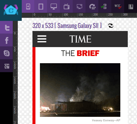
CyberCrab is the website which let you check your website on different preset resolutions as well as using the custom resolution. The preset resolutions are categorized as Mobile, Desktop, Tablet, Television. Each of the category gives you a list of different resolutions, you need to choose the one you want to test your website on. The other options include rotate screen, enable/disable scrolling, W3C validator, and Bookmark for future.
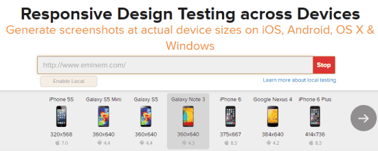
12. ResponsiveTest.net:
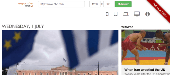
The next website in the list is ResponsiveTest.net and it also lets you choose between preset and custom resolution. You can look for the available preset resolutions under following options: Phone, Tablet, Desktop, Laptop. There is also an option to rotate the chosen resolution with just one button. It means if you have selected 1024*768 resolution, then you can rotate it to 768*1024 with just one click.
13. TestSize.com:
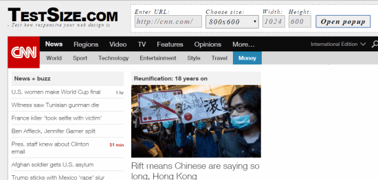
TestSize.com is the last website in this list to test your website on different resolutions. It doesn’t have a list of devices, but it shows the list of 7 types of resolutions ranging between 240*320 and 1920*1024. You can also enter any custom resolution of your choice. Once you have entered the URL and chosen the resolution, you can interact with the website just like you do on any device.
These are the 13 tools to test your website on different screen resolutions with ease. You neither have to spend money for buying multiple nor have to look for friends owning any of those devices. Give them a try and share your views using the comments section below.
Note: Apart from above mentioned 13 tools, I also tried to test the W3C Mobile Checker. However, it didn’t work for me as it kept loading after entering the URL of the website. At the time of writing this article, the tool was in Alpha phase so I am expecting it to improve as the time will pass. You can click on the link to check if it’s working.
You may also like: 5 Free Online HTML Validator Websites.