In this post, I am going to talk about some free tools to generate responsive images for your website. These tools are online web apps where you can upload an image and generate the corresponding responsive images, and download them. These online tools intelligently calculate breakpoints for the image after you upload them to generate the responsive images without any sign up or water mark. You can later download all the generated variations of the input image in a ZIP file.
Modern websites require to be responsive by design as well as according to the SEO standards. Responsive images can be rendered on a device of any screen size and they contribute a lot to the user experience as well. Unfortunately, as a non web developer coma it can be tedious to manage multiple responsive versions of images by yourself. And that’s why I am here mentioning some free tools that you can use to generate responsive images online along with the HTML5 code.
3 Free Responsive Images Generator Online
Responsive Image Breakpoints Generator
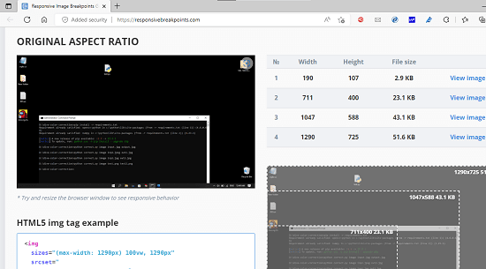
This (homepage) is one of the best websites that you can use to generate responsive images. This service is backed by Cloudinary image CDN and does not require any sign up or registration. This is a very intelligent tool that automatically calculates breakpoints for the uploaded image and generates the equivalent images in different dimensions that will fit most of the devices out there. It even allows you to control image breakpoint generation so that you can have perfectly resized images for your website. Not only that, but along with the responsive images, it can also generate the HTML5 code that you can place on your website.
Since there is no registration, you can just visit this web app using the link above and then start using it to generate responsive images. You start by uploading photo/image from your computer and then select the step size and maximum number of images you want to generate. If you don’t know about the input parameters, just don’t touch them and keep them default. Finally, start the image generation process, and it will hardly take a few seconds to show you all the images that it has generated. You can check out the equivalent HTML5 code and the option to download all the generated responsive images in a ZIP file.
Blue Compass
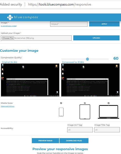
Blue Compass is another very nice and powerful website that you can try to generate responsive images online. This is pretty much like the above one but it works in a very straightforward manner. It just takes an image from you and then generates the multiple images of different dimensions automatically. The generated images will be filled automatically based on the device size they are loaded on. However, just like the website above, it can’t generate the HTML5 code with srcset attribute. But it does allow you to compress the uploaded image before starting the responsive image generation process.
Open this web app and then simply start by uploading an image. You can give it an image from your computer or you can simply give it an image URL to fetch it automatically. Next, you can specify the compression settings. After that, you need to select the devices for which you would want your uploaded image to be responsive. Finally, you specify the image caption/title and then download the images. This is as simple as that. Before downloading the generated responsive images, you can preview them one by one as well. Or you can even restart the image generation process again if it is needed.
Derivv
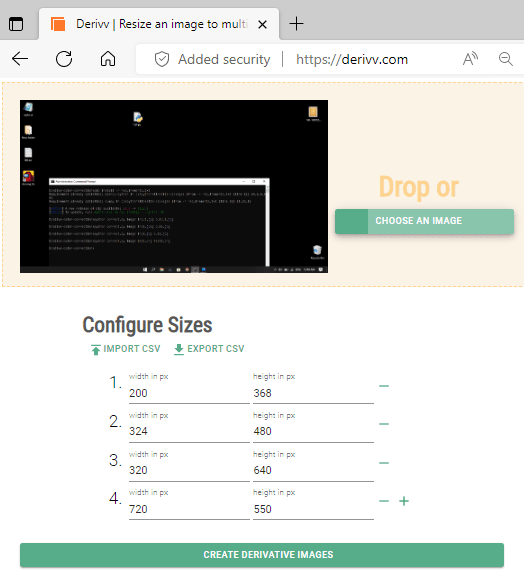
Derivv is yet another simple website that you can use to generate responsive images. However, this tool is a bit different from the other two that I have mentioned above. This is basically image resizer but it has option to resize a single image into multiple dimensions. And it can take the final image resolutions from a CSV file and resize the current image according to the custom width and height specified in that CSV file. And that is why I have included it here. It works in a straightforward manner and the only difference is that here you will have to manually specify the width and height in order to generate the responsive images.
There is no sign up or registration and you can just get it started with this website right away. Simply start by uploading an image and then specify the final width and height. You can specify the new image resolution in a list by manually adding them. Or, you can upload a CSV file to specify the final image dimensions. Finally, you start the image generation process and when it is done, it will give you a ZIP file that you can download on your computer. This way, you can keep using this tool anytime you need responsive images for your blog or eCommerce website.
Final thoughts:
These are the best free online tools that you can use to generate responsive images for your web apps or mobile apps with ease. All these tools work perfectly and you just need to give them an input image. The first two websites in the list are prefect for developers and general users as they automatically calculate breakpoints and list the final image dimensions automatically. But the 3rd one will need assistance of a UI designer in order to calculate the correct width and height in order to make the images responsive.