This article covers a free web app where you can create charts with Excel data online and sync with live data. Spreadsheets are widely used to save the various types of databases ranging from simple data to complex data with dozens of columns. The more columns a spreadsheet gets the more it become complex and hard to analyze. If you also have a complex Excel file that you want to analyze, you can ease the process by using Explore.
Explore by Charts.com is a free web app where you can import your database from a spreadsheet and then create charts to easily analyze the database. You can import the database from an Excel sheet, Google Sheets, and CSV file either from local or cloud storage. Once the database is imported to the app, you can create numerous interactive charts based on the different data points in your database. Within a chart, you can create segments, add conditions, calculate fields, etc. Finally, you can create a dashboard for the database which you can download as a PDF file and get code to embed on the webpages.
Also read: Free Online Chart Maker to Visualize Data, Download as PNG
Create Charts With Excel Data Online, Sync with Live Data
To create charts with Excel data online, visit the Explore app landing page and create a free account. You can also use this app without an account. After that, you can just import your database and start creating charts.
Import Data Source
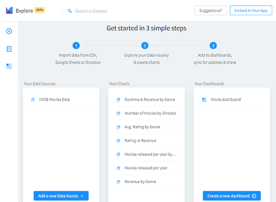
On the landing page of this app, you get 3 steps laid out to creating charts. The first step is to add a new data source to import the data. This step allows you to import a database from CSV, TSV, Excel file, Google Sheets, and Dropbox. You can import multiple databases and merge that together in charts to have a detailed analysis.
Charts
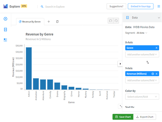
After importing the database, you can filter the columns, configure data and columns, and create calculated and customized columns. Then, you can select two columns to create a chart and visualize the data. Similarly, you can create as many charts as you want from your database. In the case of multiple databases, you can pick one data column from each database and create a chart.
The charts are interactive which makes it easy to analyze and evaluate the data. On top of that, you can switch the axis, pick a color, chart sorting order, apply chart filters, and pick chart type. The charts are saved to your account and you can export each chart as a PDF file as well.
Dashboard
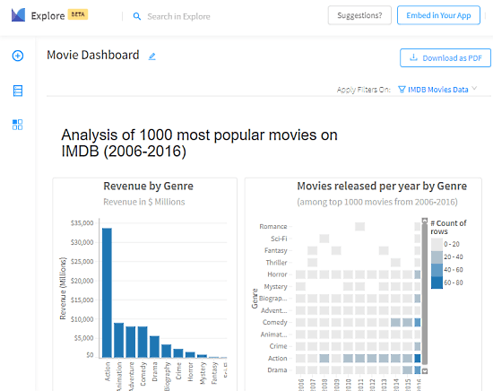
Based on your database and charts, this app builds a dashboard for you where it visualizes all the data from your database. You can export the dashboard to a PDF file or get an embed code to add to your app or webpage.
Closing Words
Explore by Charts.com is a handy app that allows you to easily analyze complex databases by visualizing it on charts. The interactive charts not only makes it easy to analyze the data but also make it simple to present it to others. This app does all the process and chart creation locally on in your web browser so none of your data leaves your computer.