Blisk is an innovative browser compatible with Windows, macOS, and Linux operating systems and is tailored for developers. It is equipped with several integrated devices and furnishes teams and freelancers with an efficient workspace to accelerate the development and testing of contemporary web applications, enabling an increase in productivity.
From freelance segments to enterprise-level projects, it serves as a valuable tool for Cross-Device testing. This versatile browser proves particularly beneficial for web developers, quality assurance engineers, web designers, marketers, and various other IT professionals, facilitating the easy development and testing of modern web applications without overlooking any potential issues. Apart from using it as a workspace for web development (Developer Mode) is can also be used as a regular browser to search for something across the web (Browsing mode).
What is Cross-Device testing:
Cross-device testing is a software testing approach that evaluates the functionality, usability, and visual consistency of an application or website across diverse formats and devices. The objective is to guarantee a consistent user experience irrespective of the device used. This form of testing considers variations in screen sizes, resolutions, input methods, operating systems, and other relevant factors.
Blisk supports cross-device testing for all types of web applications, regardless of whether they are in a production or development/staging state. It’s important to note that, at present, native mobile apps for iOS, Android, and iPad OS are not supported. You can also natively integrate with your local web server by pasting the address of your localhost into the address bar and launching your local website in Blisk automatically.
Devices Supported:
Blisk natively offers support for over 80 devices, including mobiles, tablets, laptops, and desktops, both as standalone units and in multiple configurations. When using multiple devices, they synchronize their URL and scroll position, allowing you to seamlessly work with the same segment of code across all the open devices.
The following is the list of the devices supported by Blisk along with the Resolution:
- iPhone 15, 393 × 852
- iPhone 15 Plus, 430 × 932
- iPhone 15 Pro, 393 × 852
- iPhone 15 Pro Max, 430 × 932
- iPhone 14, 390 × 844
- iPhone 14 Plus, 428 × 926
- iPhone 14 Pro, 393 × 852
- iPhone 14 Pro Max, 430 × 932
- iPhone SE 2022, 375 × 667
- iPhone 13 Mini, 375 × 812
- iPhone 13, 390 × 844
- iPhone 13 Pro, 390 × 844
- iPhone 13 Pro Max, 428 × 926
- iPhone 12 Mini, 375 × 812
- iPhone 12, 390 × 844
- iPhone 12 Pro, 390 × 844
- iPhone 12 Pro Max, 428 × 926
- iPhone 11, 414 × 896
- iPhone 11 Pro, 375 × 812
- iPhone 11 Pro Max, 414 × 896
- iPhone SE 2020, 375 × 667
- iPhone X, 375 × 812
- iPhone XR, 414 × 896
- iPhone XS, 375 × 812
- iPhone XS Max, 414 × 896
- iPhone 8, 375 × 667
- iPhone 8 Plus, 414 × 736
- iPhone 7, 375 × 667
- iPhone 7 Plus, 414 × 736
- iPhone 6s, 375 × 667
- iPhone 6s Plus, 414 × 736
- iPhone SE, 320 × 568
- Google Pixel 6, 412 × 915
- Google Pixel 6 Pro, 412 × 892
- Google Pixel 5, 393 × 851
- Google Pixel 4, 393 × 830
- Google Pixel 4 XL, 412 × 869
- Google Pixel 3, 393 × 786
- Google Pixel 3 XL, 412 × 846
- Google Pixel 3A, 393 × 808
- Google Pixel 3A XL, 412 × 824
- Google Pixel 2, 412 × 732
- Google Pixel 2 XL, 412 × 824
- Google Pixel, 412 × 732
- Google Pixel XL, 412 × 732
- Galaxy S22, 360 × 780
- Galaxy S22 Plus, 384 × 832
- Galaxy S22 Ultra, 384 × 824
- Galaxy S21, 360 × 800
- Galaxy S21 Plus, 384 × 854
- Galaxy S21 Ultra, 412 × 915
- Galaxy S20, 360 × 800
- Galaxy S20 Plus, 384 × 854
- Galaxy S20 Ultra, 412 × 915
- Galaxy S9, 360 × 740
- Galaxy S9 Plus, 412 × 846
- Galaxy S8, 360 × 740
- Galaxy S7, 360 × 640
- Galaxy S6 Edge, 360 × 640
- Galaxy S6, 360 × 640
- Galaxy Note 5, 480 × 853
- LG G6, 360 × 720
- OnePlus 5t, 360 × 720
- iPad Mini 4, 768 × 1024
- iPad 10, 810 × 1080
- iPad Pro 9, 768 × 1024
- iPad Pro 10, 834 × 1112
- iPad Pro 12, 1024 × 1366
- iPad Pro 11 (2021), 834 × 1194
- iPad Pro 12 (2021), 1024 × 1366
- Desktop HIDPI-XL, 2560 × 1440
- Desktop HIDPI, 1920 × 1080
- Desktop MDPI, 1440 × 900
- Desktop 4K 1X Scale, 3840 × 2160
- iMac Pro Retina 5K 27, 3200 × 1800
- iMac Retina 4.5K 24″, 2240 × 1260
- iMac Retina 4K 21.5″, 2048 × 1152
- iMac Retina 2016 27″, 2560 × 1440
- MacBook Air, 1440 × 900
- MacBook, 2304 × 1440
- MacBook Pro, 1440 × 900
- Laptop-M, 1366 × 768
- Laptop-S, 1280 × 800
Features:
Devices stack: There are preinstalled devices in Blisk including phones, tablets, laptops and more.
Viewports: There is a long list of devices with the required viewports ranging from small devices like iPhone SE to large desktop screens.
Touch event support: All the built-in devices support the native touch events such as swipe, tap, double tap and more.
Orientation: Portrait and landscape both modes are supported.
Native user agents: Blisk provides native user agents, empowering you to manage the rendering of distinct versions tailored to the native browsers of individual devices.
Different OS: Blisk offers a diverse range of operating systems, spanning from mobile platforms like iOS and Android to desktop systems like Windows and macOS. You also get access to main devices from various vendors like LG, Google, Samsung, Microsoft, Apple, etc.
Side-by-side view: For testing or development purposes you can enable side-by-side view of mobile and desktop devices.
URL & Scroll sync: Blisk offers a single URL to navigate both the mobile and desktop devices so that you need not copy-paste the URL repeatedly. Also, you can preview the same content on both the devices as Blisk automatically synchronizes their scroll position.
Auto-refresh: Paes are auto-refreshed when you modify the source code resulting into a boost in your development work.
Error notification: Blisk automatically notifies you about any issues with JavaScript or regarding the failed resources that did not load correctly.
Screenshots: Take screenshots and share with team members.
Screen recorder: Blisk enables you to grab a video of the whole screen in just a click and share it with your team.
Cloud storage: Your screenshots and screen recordings are stored in the cloud and can be accessed from anywhere.
Image editor: Blisk provides an inbuilt image editor that you can use to annotate the screenshots or your local images.
How it Works:
1. Click on this link to download Blisk for Windows, macOS or Linux.
2. Install the application in your system and launch Blisk.
3. Click on ‘New Device Set’ and choose all the devices on which you wish to perform the testing. Each device that you select will appear on the list of ‘Selected Devices’ in the right-side panel. You can filter the devices by ‘type’ such as iOS, Android, Laptop and more using the options at the top of the ‘Device set’ window.
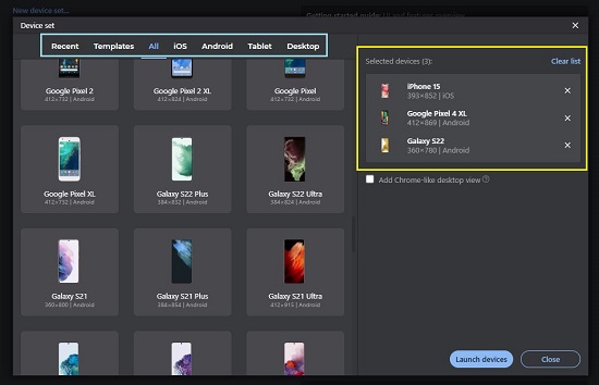
4. Finally, click on the button ‘Launch devices’ and all the selected devices will appear side-by-side in the browser window. Type the URL of the website or web application in the address bar at the top and observe that it appears on all the devices simultaneously.
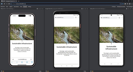
5. As discussed in the ‘Features’ section above, if you scroll the website up / down, Blisk automatically synchronizes the scroll position on all the devices that you have launched.
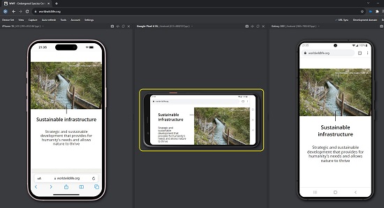
6. You can click on the drop-down list at the top left of the viewport to select another device if required. To rotate the device, click on the corresponding button at the top right of the viewport.
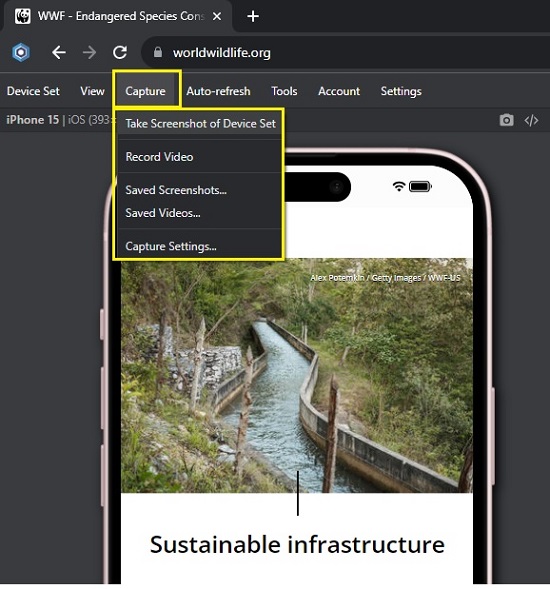
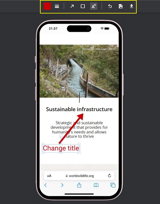
7. To take a single device screenshot, click on the ‘Camera’ icon at the top right. Similarly, to take a screenshot of the entire device set that is visible on the screen click on ‘Capture’ in the top menu bar and choose ‘Take screenshot of Device set’. As soon as the screenshot is captured, it will appear in the Blisk image editor where you can Edit or Annotate it as per your requirements. You can also go ahead and record a video of the entire screen from the ‘Capture’ menu.
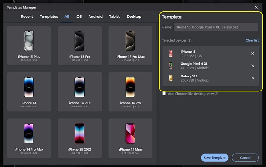
8. Blisk allows you to save the current device set that you have loaded as a Template. For this, you must click on ‘Device Set’ in the menu bar and then choose ‘Create Template’. Assign a name to the template and click on the ‘Save Template’ button at the bottom right of the pop-up window.
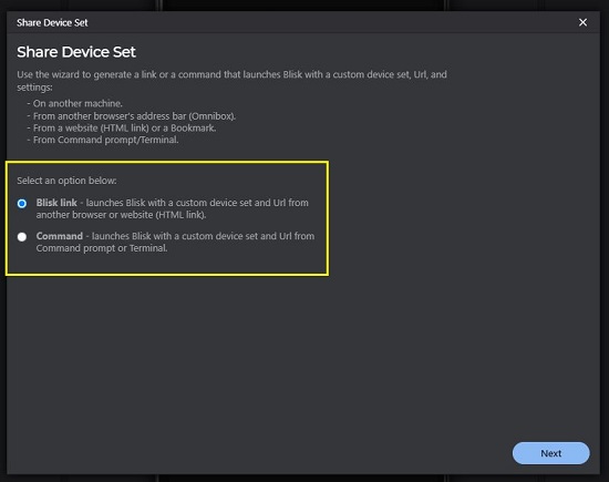
9. You can share the current device set with others by way of a Blisk link or a Command that launches Blisk with a custom device set. For this, click on ‘Device Set’ and choose ‘Share Set’.
10. For any settings pertaining to Devices, Device-sync, Theme, Auto-refresh and more, click on ‘Settings’ in the menu bar.
11. Click on this link to watch a Tutorial and Demo to further understand its features. If you require an in-depth documentation, you can click here to go through the ‘Getting Started Guide’.
Closing Comments:
Blisk is a wonderful and amazing browser for Windows, macOS and Linux, equipped with a variety of integrated devices that you can use for cross testing your websites and applications. It thus provides a great workspace that helps you to accelerate the development and testing of your projects thereby increasing the productivity.
It is slowly turning into the default workspace for thousands of IT professionals around the world while helping them deliver better products faster. Go ahead and try out Blisk and do write to us about what you think.
Click here to download Blisk.
Click here to explore ‘Opera One’ — an early access version of a completely revamped browser poised to replace Opera on Windows, macOS, and Linux. It is based on the principles of Modular Design and promises to revolutionize your browsing experience with a distinctive liquid navigation interface that enhances user perception.