This article covers an extension to do free responsive website testing for Chrome with multiple screen sizes. Responsive website testing checks the appearance of a website with Responsive Web Design verifying that it can render in a flexible manner on the basis of devices and screen sizes. This test is part of website testing to ensure that the website would look proper no matter the screen size.
Responsive Viewer is a free Chrome extension that allows you to perform responsive website testing in one place. This extension shows multiple screens in one view where you can test the responsiveness of your website on different screen sizes. It offers pre-built templates for various popular screen sizes along with an option to create custom screen sizes for various agents. This allows you to test your website on a vast variety of screen sizes. With that said, let’s check it out in detail.
Also read: Cross-Device Website Testing Tool to Browse Website Across Different Devices
Free Responsive Website Testing with Multiple Screen Sizes
To test website responsive install the Responsive Viewer extension to your Google Chrome browser. This extension is freely available on the Chrome Web Store. Once installed, you can jump right into it and start testing the responsiveness of any website.
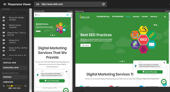
To perform responsive website testing, click this extension icon from the address bar. This opens a Responsive Viewer in a new tab where you can enter the URL to the website. It lists all the screens on the left and shows the active screens on scrollable canvas. You can set the canvas view (scroll) to portrait or landscape and change the screen orientation as well. From the screen panel, you can rearrange the screens and make them visible or hidden.
By default, you get the following screen size options:
- iPhone XR, XS Max
- iPhone XS, X
- iPhone 8, 7, 6S, 6
- Pixel 3, 3 XL
- Galaxy S9, Note 8, S8
- Medium Screen
- Large Screen
- Custom Screen
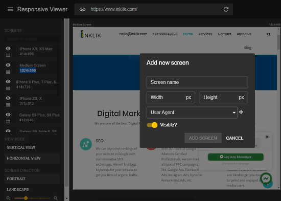
If you don’t find the pre-built screen size templates enough, you can create new custom screen sizes for various user agents. While creating a new screen, you can select any of the following user agents:
- Google Chrome
- Mozilla Firefox
- Microsoft Edge
- iPhone
- iPad
- Samsung Phone
- Google Pixel
This extension loads your website on all the active screens. You can test each screen to check the appearance, scrolling, and layout. This way, you can test the responsiveness of your website on various screens in one view.
Wrap Up
Responsive Viewer is a handy extension for front-end developers to test website responsiveness in one place. The pre-built templates feature all the popular screen sizes and on top of that, you can create any number of custom screens as per your requirement. It is good for testing responsive websites as well as web applications. Try it yourself and let us know your thoughts in the comment.