Candlestick Chart Generator is a Free Online Graphing Tool that is used to create Candlestick Charts from user defined parameters and download them as a PNG image.
Apart from defining the Data Set, users can specify the Chart Title, description of X & Y axis, Font type and size, Colors and more to make the chart look visually appealing and interactive.
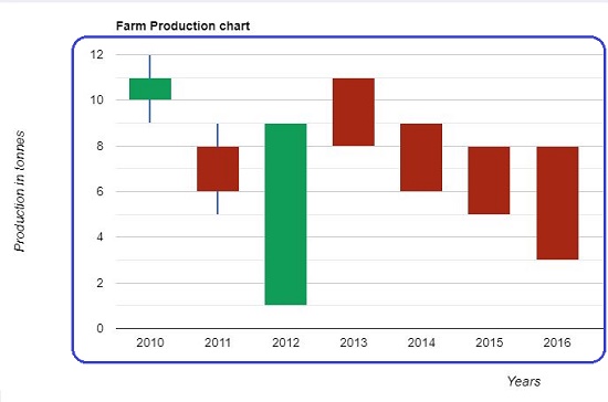
Candlestick is a chart that is used in stocks, commodities and probably any market that you can think of, to keep track of price movement, production values and more. It is used in all possible time frames ranging from long term to daily basis.
Anatomy of a Candlestick Chart
The Candlestick chart is plotted with help of a data set that contains Open, Close, High and Low values for a specified time period.
Each Candlestick comprises of a Real Body and 2 Wicks these are called Shadows. The solid candle part is the Real Body and depicts the difference between the Open and Close values for the specified period. If the Real Body is missing it means that the Open and Close values are almost the same. Rising and Falling values are depicted with different color so that they are easily identifiable.
The Wicks or Shadows are the thin lines that appear at the top and bottom of the Real Body. They depict the fluctuation of the values above and below that of Open and Close values. The uppermost part of the Wick depicts the highest value for the specified period and vice versa.
Absence of an upper Wick indicates that the top of the Real Body (open value) coincides with the highest value for that period. Similarly, the absence of a lower Wick specifies that the close value during that period was the same as the lowest value.
How it Works:
1. Navigate to Candlestick Chart Generator using the link provided at the end of this article.
2. Define the data set in the ‘Input Chart Parameters’ box using the following pattern:
Time period: Low value, Open value, Close value, High value
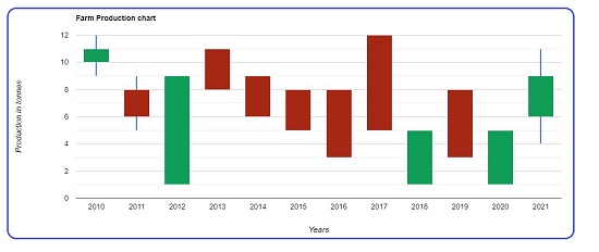
For example 2010: 9,10,11,12 would mean that in the year 2010, the Lowest value (price, production quantity etc.) was 9 units and the Highest value was 12 units. The Open and Close values were 11 and 12 units respectively.
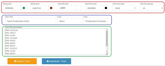
3. Type the Title of the Chart and the X and Y axes descriptions.
4. Define the Rising and Falling Colors as well as the Foreground and Background colors.
5. Select the Font style and its size.
6. Finally click on ‘Update Chart’ at the bottom to generate your Candlestick Chart. Any changes that you make will be reflected in the Chart only after you click ‘Update Chart’.
7. Once you are satisfied with the visual appeal, click on ‘Download chart’ to save it in your local disk in PNG format.
Verdict:
Candlestick Generator is a wonderful, yet simple tool to generate Candlestick Charts easily in just a few minutes. The options to specify the Fonts and Colors are very handy and make this tool very important for traders and other business persons.
Click here to visit Candlestick Chart Generator and try to create your first chart.