This article covers a free interactive map of responsive screen sizes for web designs. There are lots of devices in the market with different screen sizes. Screen sizes are very important from a designer’s perspective. It’s like the screen is the canvas and you should know the dimensions of your canvas for optimal utilization.
Screen Size Map is a free website that has an interactive map of responsive screen sizes. This website packs various popular screen sizes in an interactive layout. It covers portrait and landscape screen sizes from as low as 414px to as high as 1441px. The screen sizes use different colors to differentiate from each other and you can filter them as per dimensions. Let’s check it out in detail.
Also read: Share Web Design Screens Organized Like Website Menu: Drafta
Free Interactive Map of Responsive Screen Sizes for Web Designs
When you open this website, you get all the featured screen sizes stacked on top of each other. The bigger screen sizes are at the top with small and low-resolution screen sizes on top. You can move your mouse cursor on a screen size to get its details.
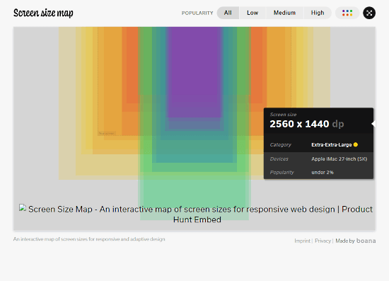
When you move the cursor on screen size, a pop appears next to with the following details:
- Screen size (in dp)
- Category
- Devices
- Popularity
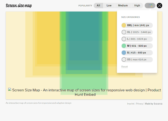
From the top of the interactive map, you can filter out the screen sizes by Low, Medium, and High dimensions. If that’s not enough, you can also filter the screen sizes by the exact resolution range. You get the following options for resolution-based filters:
- XXL (min 1441 px)
- XL (1025-1440 px)
- L (801-1024 px)
- M (601-800 px)
- S (415-600 px)
- XS (max 414 px)
You can also expand the website to full screen to analyze the screen sizes and their difference in detail.
Give it a try here.
Closing Words
Screen Size Map is a nice website to easily get details on popular screen sizes. It can be very handy for web designers to quickly check out the popular screen sizes and optimize their designs for that. Give it a try yourself and share your thoughts in the comments section.