This article covers an interactive climate change map to visualize climate impact. Climate change is real and its impact is visible all over the world. Temperature is rising, glaciers are melting, sea level is rising, and so on. These climate conditions are affecting life in a seriously bad way. Many rare breeds of animals and birds have been extinct and many more are on their way to extinction. Rising temperature, melting glaciers, and rising sea level is a danger thread to coast area and people living there. There is much more impact of climate change which can’t be covered in this single post.
Climate Impact Map is an online interactive climate change map that visualizes the impact of climate change on Earth’s temperature. This map shows the average annual as well as seasonal (summer & winter) temperature changes under different emission rates. It also predicts the temperature in the mid and end of this century based on absolute level or change from history. So, let’s check it out in details.
Also read: How to Know the Air Quality Index of your City
Interactive Climate Change Map to Visualize Climate Impact
This interactive map is created by Climate Impact Lab to measure the real-world cost of climate change. It shows how climate change is heating up the planet and raising the surface temperature.
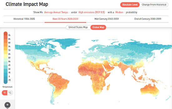
Climate Impact Map shows you the surface temperature of the entire planet. On the left side of the map, there’s a temperature scale where you can see which color represents what temperature scale. From here, you can also change the temperature unit as per your local unit system.
This map shows you the annual and seasonal temperature based on emission rate and probability. You can change the emission rate and probability to see the respective temperature impact.
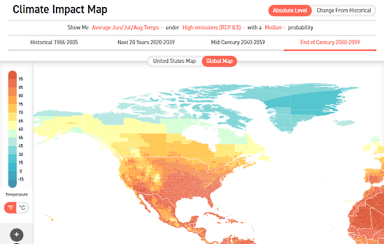
Based on the historical data, this map also predicts the temperature over the next 20 years, mid of the century, and the end of the century. You can change the emission rate and probability to see the temperature difference for those predictions.
Check out the climate impact here.
Wrap Up
This interactive climate impact map gives us a glimpse into the reality based on our current emission and temperature rate. The predictions are calculated data which is going to be true if we globally don’t consider the climate impact and work to minimize it.