LiveGAP Chart is a free online chart maker to create animated charts of simple data sets. It lets you easily create different types of animated charts, like Line Chart, Bar Chart, Radar Chart, Polar Area Chart, Doughnut Chart, and more. You can simply select any of the chart types and then enter your data on the spreadsheet panel. It also offers various predefined templates for each type of chart, which you can choose for creating animated charts. After that, you can customize various aspects of the chart like colors, inGraph data, legend, segment, background, etc.
There are many core chart maker software available which let you create charts. But, one feature that makes this online chart maker unique is “Animation“. This feature is pretty cool as it makes data representation using charts interesting and visually appealing. When you’re done with creating animated charts, you can save them as images, HTML files, or store them online.
How to Create Animated Charts using this Online Chart Maker:
To get started, simply visit the homepage of “LiveGAP Chart” and then you can start creating animated charts right away without any registration. But, if you would like to save your charts online, then you would need to create an account on LiveGAP Chart.
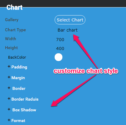
After that, simply click on the “Create Your Chart” button and then the chart editor window will open up. Initially, you will see a demo chart along with sample data. Now, you can go ahead and start with customizing the chart style. To do this, simply click on the “Chart” option on the right panel. After that, you will be able to select a predefined chart template, chart type, size, back color, padding, margin, border, etc., as shown below.
Currently, it lets you create a Line Chart, Bar Chart, Stacked Bar Chart, Horizontal Bar Chart, Horizontal Stacked Bar, Bar Line Chart, Radar Chart, Polar Area Chart, Pie Area Chart, Doughnut Chart, and Graph.
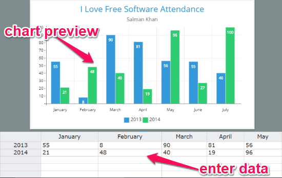
When you’re done customizing the chart style, you can simply enter your data on the spreadsheet panel. The panel will be visible at the bottom of the chart preview with sample data. You can simply edit those data or copy/paste data from Excel, Google Sheets, etc. As you enter the data, you will be able to see the changes in the chart preview.
Apart from customizing chart style and entering data, you can also edit the following aspects of the chart from the right panel:
- Colors: This will allow you to choose a predefined color scheme and change fill and stroke color of the rows and columns on the chart.
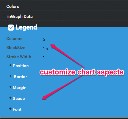
- inGraph Data: It lets you change the data type, data position, font of data text, and add a border.
- Legend: You can use this option to change the number of columns, block size, stroke width, position, margin, and more for the legend entries.
- Text: It will allow you to change the title text, subtitle, and footnote along with their margin border, and fonts.
- Annotation: This option can help you change the label type, background color, padding, border, and font of the label.
In addition to these aspects, you can also change other aspects which are associated with each chart type. For example, if you’re creating a bar chart, then you will be able to customize the bar style, scale, axis, grid, etc.
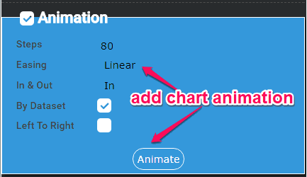
In addition to that, you will also see a section named, “Animation” at the bottom of the right panel. This section will allow you to add animation to your charts. You can simply select the number of steps, easing type, in & out option, and animation style (by dataset or left to right) to add animation to your chart. Once you’re done, you can click on the “Animate” button to preview the animated chart.
When you’re all set with your animated chart, simply click on the “Save” button at the bottom of the chart preview to save your chart. You can either save the chart online or save it as an image to your PC. Apart from that, you can also save the chart as HTML file or get the auto-generated embed code.
Closing Words:
LiveGAP Chart is a pretty useful online chart maker which converts simple charts into something interesting by adding animation. Personally, I like it because it offers dozens of customization options which can help you create a chart in any way you want. The different chart types and predefined templates are also very useful as you won’t need to customize the chart layout manually anymore. So, go ahead and give it a try.