We send and receive lots of E-mails on a daily basis. Most of the times, it’s just random pictures and other stuff added up as attachments. Hell, most of the times we don’t even write a damn word in the “body” of our E-mails. But there are times, when we have to send and receive really important E-mails, Let’s just say, an application for a job interview to a prospective employer. And I’m sure you guys will agree that more often that not, at least in casual E-mail correspondences, we totally neglect what font (a particular way alphabets, numbers and special characters are displayed on a computer) we use. We write using whatever default settings our E-mail editor offers, and hit the Send button.
But you know what? This is wrong. It may not be life threatening, but it certainly shows how well the sender is aware of the E-mail etiquette(s). Today ILFS is going to shed some light on this very important thing. Read on, fellas!!
Why Choosing the right E-mail font is important?
- It’s one of the first, if not “the” first things that the reader notices, on receiving your E-mail.
- Choosing the right font goes a long way in creating a first hand visual impact on the reader.
- The right font can indulge your E-mail’s reader to read your entire E-mail sincerely. Conversely, a carelessly chosen font can put off a reader so that he/she just skims over your E-mail, thus denying you the opportunity to convey your message effectively.
- A carelessly chosen font creates a negative impression on the mind(s) of your E-mail’s reader(s).
Ok, so the choice of font is important. But then, how to choose wisely?
Before explaining this, a little explanation of the two major type of typefaces commonly used, is in order
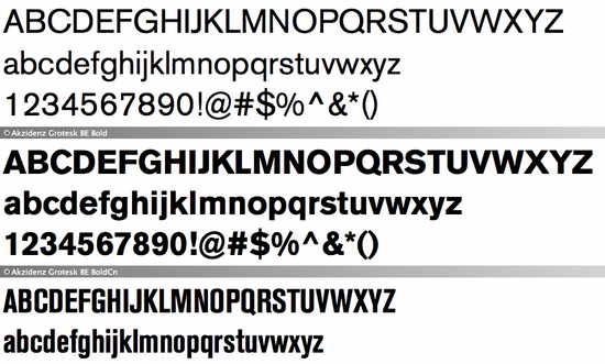
1.) SANS SERIF Fonts
These are the fonts that do not have “protruding” or “pointed” edge like characteristics at the end of the strokes. Some popular examples of Sans Serif fonts included in almost all recent Windows family OS versions include Arial, Tahoma, Impact etc..
Here’s a screenshot, illustrating a Sans Serif font in its three variations (Normal, Bold and Bold Condensed)
2.) SERIF FONTS
These are the exact opposites of Sans Serif fonts. Serif fonts are the font faces that have “protruding” or “pointed” edge like characteristics at the end of the strokes. Some popular examples of Serif fonts included in almost all recent Windows family OS versions include Times New Roman, Georgia, Cambria etc..
Here’s a screenshot, illustrating a Serif font (displaying Upper case, Lower case alphabets and numbers)

As is clearly illustrated by the above screenshots, the two type of font faces have a really subtle difference. Interestingly, this goes a long way in deciding which fonts are chosen for different kinds of requirements, not just in things like E-mail and online articles, but in print media like newspapers too.
The Big Question: How do I decide which font(s) to choose for different parts of my E-mail?
The E-mail editors of major E-mail service providers don’t offer a large variety of choices of fonts for E-mail. Conversely, E-mail Clients offer a far greater choice. But overall, some general rules hold true while choosing fonts. The following pointers should help in making anyone, an informed choice.
- The first and the most important thing is to choose a font that’s fairly standard across multiple E-mail service providers. For example, Arial (Sans Serif) and Times New Roman (Serif) are the two font composition choices that almost every major (and minor) E-mail provider offers. Ditto for all E-mail clients. This ensures that regardless of what E-mail services you and your E-mail’s recipient use, your E-mail(s) will always look consistent.
- Proper choice of font size is of prime importance. For all major intents and purposes, the “body text” should be 12 pt. in size, and “headings” should be 14 pt. in size.
- Be sure to leave proper spacing in between paragraphs.
- Text alignment is also important. Although the default “left alignment” serves just well for everyone, I prefer the “justified” alignment. But then, that’s an entirely personal choice.
- Never use all Capital or Uppercase letters for E-mail’s body text. Using CAPS LOCK is considered the online equivalent of Shouting.
- As far as possible, the usage of fancy colors for E-mail text should be avoided.
- When adding your signature at the end of the E-mail, format your name as “Bold”, and Underline the E-mail address. Feel free to experiment
Although the above mentioned choices may not appeal to those who prefer stylish fonts, but they certainly will make your E-mails look more homogeneous.
A Sample E-mail, Composed in Gmail and sent to an Outlook E-mail address using the above pointers.
Using Arial, a Sans Serif Font

Using Georgia, a Serif Font

Conclusion
With an increasing amount of important correspondences going the way of E-mail, the choice of good looking and consistent fonts for our E-mails becomes all the way more important. The first impact created by a nicely written E-mail can be positive. Conversely, the first impact of an E-mail written and formatted carelessly can be a major turn off for the recipient. Thus, we should exercise prudence while choosing the right fonts for our E-mail communications, to make sure that our message gets to the other end, loud and clear.
What do you guys think? Do you use some specific fonts for your E-mails? Or do you use just the defaults offered by the editors. Let me know your thoughts in the comments below.