Data GIF Maker is a free data visualization website by Google to create animated GIF of data. Using this website, you will be able to easily create a GIF by drawing a comparison between two different data sets. To draw a data comparison, all you got to do is enter two data points, add data titles, choose a different color for each data, and enter the explanatory text for both the data. You can also decide whether you want to show the data evaluation in “percentage” or “addition”. After that, you can simply play the data comparison online or download it as an animated GIF. Ultimately, you can use this website to show your simple data in a more visually appealing way with the help of an animated GIF.

Google has been developing some simple, useful, and interesting web applications like AutoDraw, A Google A Day, and more. And this time they have come up with “Data GIF Maker” to help you visualize your simple data comparison in an animated GIF. The best part of this website is that it doesn’t restrict you to any specific type of data, which also means the data comparison can be drawn between anything like search percentage of two keywords, population of two countries, the popularity of two superheroes, critic rating of two movies, fat burning capability of two foods, and so on.
How to Create an Animated GIF of Data using this Data Visualization Website by Google:
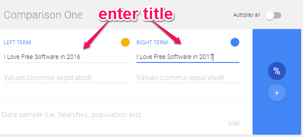
To get started, simply visit the homepage of Data GIF maker. After that, you will see a comparison widget where the first thing you need to do is enter the title for both the data.
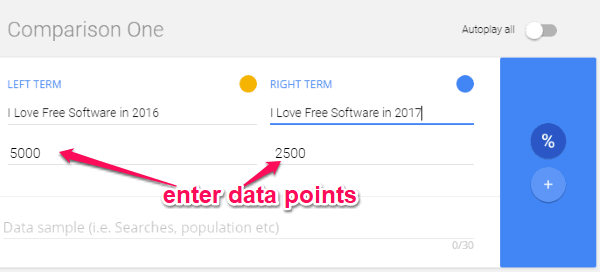
After entering the titles, you can proceed and enter the data points for both data in the “Values” input field. You can enter a single value or multiple values (separated by commas) for each data if you want.
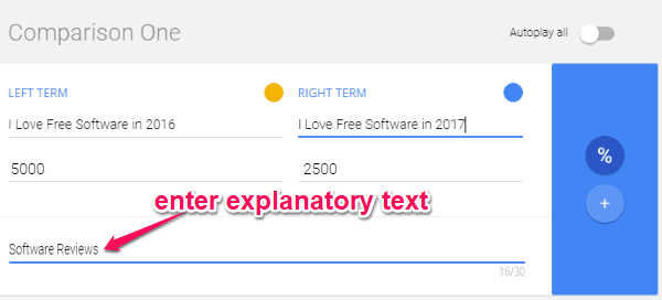
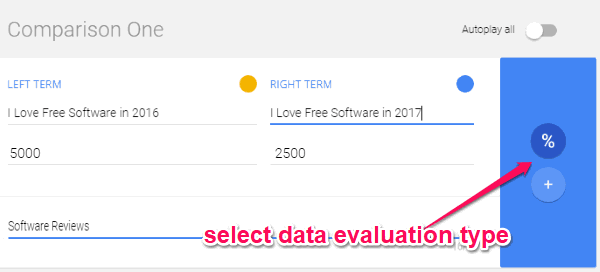
When you’re done entering the data points, simply enter the explanatory text for both data in the “Data Sample” input field on the widget. You can enter any text you like. As an example, I will enter the explanatory text as “Software Reviews”.
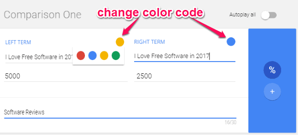
Now, you can change the color code of both data such that they can be easily identified on the animated GIF. To change the color code, simply click on the circular “Color” icon at the top of each data. After that, you will be able to choose between 4 different colors (red, blue, yellow, and green). These are actually the colors which comprise the Google logo :).
At last, you can decide whether you want to show the data evaluation in “percentage” or “addition”. For this, you can select the “Percentage” or the “Addition” icons on the right of the comparison widget.
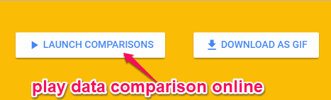
Now, your data comparison will be ready and you can either play it online or download it as an animated GIF file. To play the data comparison online, simply click on the “Launch Comparisons” button at the top right corner. This will open a new window where you can play the data comparison by pressing “Spacebar” or enable the “Autoplay” option on the widget for playing it automatically.
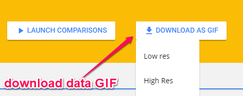
If you want to download the data comparison as animated GIF, then click on the “Download as GIF” button. After that, it will ask whether you want to download a low-resolution GIF or a high-resolution GIF. When you select either option, it will start rendering your GIF and in a minute or two, you will get your animated GIF.
Closing Words:
Data GIF Maker by Google is a very interesting and useful website which can help you easily create GIFs for simple data visualization. So, whether you’re a journalist, blogger, storyteller, movie critic, or any other professional, this website can come in handy for you to show your data in an interesting and appealing way. Go ahead and give it a try.